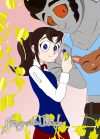
Vol. 4 Cover Art
Advertisements
X
Reading Options
Font Size
A-
15px
A+
Width
Reset
X
Table of Contents
Loading... please wait.


2

 © 2024 Scribble Hub
He looks a lot more ugly than I thought.
Yeah, it's not my best work. I couldn't quite capture his feminine beauty. Plus, I was going for more stylized shading with the heavy blacks, but it didn't quite look right. I'm looking to redraw it, but these are cover concepts as my skills aren't quite up to snuff. I'll replace it once I draw something better.