Illustration [1]
X
Reading Options
Font Size
A-
15px
A+
Width
Reset
X
Table of Contents
Loading... please wait.

Any thoughts? Is there anything that needs to be changed?
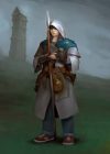
96


He's a lot more attractive than I was expecting actually
It's super shiny. Things also look super fantasy, I didn't expect things to look that magical in the setting considering the story seems closer to reality.
The potion-making in particular just looks strange to me. The artist has probably drawn it that way for aesthetic reasons though so it's not really their fault. Holding the flask, maybe volumetric?, just seems to be making things more difficult for yourself while she's holding the ladle to stir what I'm assuming to be a pot full of potion being heated by the green-ish flames. They have what looks like test tubes and flasks but no pipets or measuring beakers/cylinders to measure exact amounts?
He's already putting hours of work on learning about the plants and other alchemic materials so clearly the skills can't do everything. Maybe skill levels can help out when measuring exact amounts but that's just making things hard for yourself when trying to do accurate work like mixing solutions. Unless they're purposely trying to make things hard for newbies to do the same work as experienced healers... though that seems super counterintuitive when letting everyone in the Healing Temple learn potion-making.
Just my random thoughts on the illustration (or mostly just commenting on how strange the potion-making setup is).
The only thing I will say that I like shiny, and I'm up to the neck with "realistic" fantasies, why hold back...if I wanted that much reality I would not read fantasy, to begin with. The core of fantasy/action should be fantasy/action the rest is a dress-up so it does not turn not bland.
The other stuff, I agree...probably :D
Agree that it's a bit too shiny but I think it's fine.
The artist added the test tubes and flasks but I think I like it. She is holding the volumetric flask because she is about to pour its content inside? I would believe that they have the measuring instruments but place them on another workstation where they prep the materials. One workstation for prep, one for brewing
Nothing suggests this room is a sauna or is this a different room?
True. Should have made a few fumes or red instead of blue background
No long beard lol.
Is that the dark elf who was introduced as Miss Eliss in the previous chapter?
It needs more levi...
He's too intense, even when he's focusing.
Something is off about her torso angle I think. The open part of the outfit seems like it is centered on her torso but her shoulders and arm that have the potion look a bit odd if that is the case.
I think the table angle is off a few degrees in relation to her body making it seem as if her body language is past the potion.
Also I feel like Eric's jawline is a touch to sharp.
It is a nice picture, but the hero I saw in my head we rougher looking. Did they ever say exactly how old he is?
some background things : like different races or relics or tower or buildings maybe.
It is so desolate.
For the world you're depicting, it seems a bit too high fantasy and not gritty enough. I expected him to look a bit more grizzled but timeline wise he is basically a fresh faced newbie in the tower.
Also I expected the healer's robe to be a bit thicker or more tabbard like in the cover, this just seems to be a toga esque thing.